
Wednesday, 17 March 2010
Front cover ideas compilation collage
These are some things I didn't like of my ideas for my front cover.

Front Page Ideas
I changed my mind on what picture i am going to use for my cover.
Underneath i have come up with some ideas of the front page design. I have tried out a few by trying different fonts, colours and editing the image on the background. Hopefully i will be able to choose one i am happy with and use it in my final design of my front page.


Above i did not like the colour scheme of the orange text and blue aspects of the background. I felt they did not co-ordinate well and did not look very effective.


Here i included the text that will go on my magazine. I tested out where to put this text by first aligning it to the left.

I then tried it so the text was aligned to the right, though i did not like either of these.

Underneath i have come up with some ideas of the front page design. I have tried out a few by trying different fonts, colours and editing the image on the background. Hopefully i will be able to choose one i am happy with and use it in my final design of my front page.
I edited the picture to black and white on this to try out different colour schemes.
The font of this masthead I used is called Mekanik LET, i believed this suited my image as it stood out and was very noticeable. For my cover line i used the font called Palatino Linotype. The word 'sidonie' was written in Bickham Script Pro. i did not like this font as I believed it was too plain and simple. For the word 'stone' I used the font Cambria Math. I liked this font the most as i believe its distinctive and stood out on the page.

The below pictures are adaptations of the first idea (above) i have created. I have used the same fonts, with some exceptions, and changed the colours and moved text around to my desirability.

Above i did not like the colour scheme of the orange text and blue aspects of the background. I felt they did not co-ordinate well and did not look very effective.


.
Here i included the text that will go on my magazine. I tested out where to put this text by first aligning it to the left.

I then tried it so the text was aligned to the right, though i did not like either of these.

Tuesday, 16 March 2010
Contents Page Ideas
Here i have created 3 ideas for my contents page.
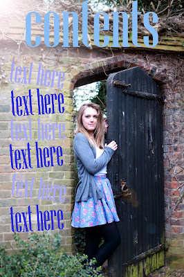
This is my evolved idea from the previous idea.

I then edited this again as i felt the font blended in too much into the background.


This is my evolved idea from the previous idea.

I then edited this again as i felt the font blended in too much into the background.


Double Page Spread Ideas
Below i have created 3 ideas for my double page spread. I wanted to include all head-shot images i took as i believed they went well with the writing on the opposite page (interveiw)
.


This is the design i am most happiest with and will use this as my final double page spread in my music magazine.

.


This is the design i am most happiest with and will use this as my final double page spread in my music magazine.

Thursday, 11 March 2010
Masthead Ideas
Using a font website i selected a variety of fonts. I downloaded these fonts and tested some of them on one of my images i have taken for my magazine. I have not decided what photograph will be my front cover yet so this will hopefully help me with decisions. These will not necessary be on the final front cover but are designed for ideas and testing.
Below are some mastheads i have tested and annotated:


Below are some mastheads i have tested and annotated:


Layout Of Double Page Spread, Cover and Contents Page
In an earlier blog I posted I drew sketch's of the layout for my front page, double page spread and contents page. After taking photos etc. I have decided to change the idea of the layout for my magazine.
Layout of Front Cover:
Double Page Spread:
Contents page:
Layout of Front Cover:

Double Page Spread:

Contents page:

Photographs For Cover, Double Page Spread and Contents Page
These are my original images and final images for my music magazine. Underneath i will show the original image then how i edited it to get my final image.
Original:

This is the edited version. I used photoshop cs3. I used the clone tool to remove the plug on the wall on the left hand corner. I also used this tool to sort out the levels (colours) and to crop the photograph.
This image will be used on the contents page.

Original:
Edit: On this picture i changed the hue/ saturation of the colour of the eyes. This made the eyes bluer and more sharpened and defined. I think brightended the picture by using the highlight and shadowing tool. This picture will be used on my double page spread.
Edit 2: Here I changed the colour to sepia and changed the highlights and shadowing to make the picture have more neutral qualities so I will be able to use a wider rang of texts when creating my front cover.
This image will be used on my front cover of my magazine.

Original:
Edit: On this picture i changed the colour temperature, added shadows and highlights and added the black and white effect. This picture will be used on my double page spread.
Original:
Edit: On this picture i changed the lighting by using the auto-fill tool on photoshop. I also used the sharpen tool to make my make my image more defined and to stand out more. This picture will be used on my double page spread.
Original:
Edit: on this image i used photoshop cs3 again. I used the clone tool to remove the plug on the wall again and cropped the photo so it was closer. I adjusted the colour levels and added shadows and highlights so the image was brighter and defined.

Original:
Edit: On this picture i simply changed the lighting by adding highlights once again and the shadowing. This picture will be used on my double page spread.
Original:

This is the edited version. I used photoshop cs3. I used the clone tool to remove the plug on the wall on the left hand corner. I also used this tool to sort out the levels (colours) and to crop the photograph.
This image will be used on the contents page.

Original:

Edit: On this picture i changed the hue/ saturation of the colour of the eyes. This made the eyes bluer and more sharpened and defined. I think brightended the picture by using the highlight and shadowing tool. This picture will be used on my double page spread.

Edit 2: Here I changed the colour to sepia and changed the highlights and shadowing to make the picture have more neutral qualities so I will be able to use a wider rang of texts when creating my front cover.
This image will be used on my front cover of my magazine.

Original:

Edit: On this picture i changed the colour temperature, added shadows and highlights and added the black and white effect. This picture will be used on my double page spread.

Original:

Edit: On this picture i changed the lighting by using the auto-fill tool on photoshop. I also used the sharpen tool to make my make my image more defined and to stand out more. This picture will be used on my double page spread.

Original:

Edit: on this image i used photoshop cs3 again. I used the clone tool to remove the plug on the wall again and cropped the photo so it was closer. I adjusted the colour levels and added shadows and highlights so the image was brighter and defined.

Original:

Edit: On this picture i simply changed the lighting by adding highlights once again and the shadowing. This picture will be used on my double page spread.

Subscribe to:
Posts (Atom)