Above is my 8 screen shots of typical conventions in a typical music magazine. I have described why I chose them and whether they were or where not typical in a music magazine.
2. How does your media product represent particular social groups?
Below i have presented a real image from a magazine which is similar to my photograph on my front cover. I have explained the similarities and differences between the two photos and whether it represents my particular social groups.

3. What kind of media institution might distribute your media product and why?
Institutionally i believe my music magazine 'Stylus' is most similar to 'Q' and 'NME' magazine. Q magazine is a music magazine Institutionally i believe my music magazine 'Stylus' is most similar to 'Q' and 'NME' magazine. Q magazine is a music magazine published monthly in the UK, with circulation of 130,179. Q magazine has an extensive review section featuring new music releases, reissues, music compilations, film and live concert reviews, as well as radio and television reviews. The New Musical Express (better known as NME) is a popular music magazine in the UK, which has been published weekly since 1952. NME magazine was the first British paper to include a singles chart. It also became the best-selling British music magazine in the 1970's. I believe my music magazine is similar to these two magazines as it is youthful, vibrant, professional and extremely similar in style and content.
4. Who would be the audience for your media product?
For my magazine i previously conducted a collage showing the type of audience (target audience) I will be attracting when making my music magazine.

My target audience was based on 16-25 year olds. I researched my target audience and found out information on what kinds of taste in music they were in to, what kinds of shops they went to, what kinds of music they listen to, their favourite film and tv programmes would be etc.
I found that: 16-25 year olds music taste is a wide variety from rock to pop. The most popular type of music for this target audience seemed to be indie/pop. I based my magazine on this idea and hoped it would attract such people that are interested in indie and pop music. I found that my target audience mainly shoped in high street fashion. This consisted of shops such as topshop, topman, urban outfitters, new look, river island etc. I made sure my magazine appealed to this sort of style by the images clothing and colours used in my photography. I also researched as said before, favourite films, programmes etc. These happened to be mainly MTV programmes such a super sweet 16, simple life, americas next top model etc. This is what also helped me create my magazine as it gave me a wider insite on what my target audience were mainly interested in.
I think my target audiecne would buy my magazine as it is vibrant, colourful, clear, bold, sharp and easy to read. The pictures capture the age group i am aiming for and also show youthfullness through the clothing and style of the model and composing of the picture itself. I believe readers from my target audience would be impressed by this magazine as it looks professional and enjoyable, hopefully leading them to buy it!
5. How did you attract/address your audience?

I chose the colour scheme of blue, white black and purple. I chose this as i felt it went well with the colour scheme of the 3 images which are situated on the right side of the double page spread. The colour of the heading on the left 'sidonie stone' i decided to put in purple. This was a last minute decision as i was not planning on putting it here until i noticed it looked empty. Using purple helped it stand out as well as fitting in with the colour scheme.
I used a simple font and colour for the text/interview. I did this as looking at previous magazines, i noticed many were like this and i thought it worked effectively giving the magazine a professional look.
I put the large S in the background of my interview. I saw this on a previous magazine and liked the idea so adapted it and created my own design. I believe this works very well as it makes the page look less empty and more interesting.
I was originally going to use 1 picture i had taken. Although after feedback i decided to include all 4 as many said they were "too good to not include" and I myself thought my page needed more than just one image.
I chose to put a blue border around my page to give it a professional finish. I also included page numbers in each bottom left and right hand corner as this would help link to my contents page. Overall i am very happy with my design as i believe it reaches my target audience and looks very effective.

This is my final front cover i have created for my music magazine task. To create this design I took aspects of my initial ideas and evolved and adapted them in order to create my final design.
For my masthead i chose to use a bright powerful colour. I believed this would stand out on the page and catch the readers eye as it is big bold and very noticeable. The main colours of my page consisted of blue/turquoise, pink, grey and black. I chose to use the name 'sidonie stone' in a different font style and colour so it would again, stand out and catch the readers eye without looking the same as the masthead. I used blue for the writing on the centre left and right as it stood out as well as going with the colour scheme of the picture (the blue eyes). I chose to put my strap line in a black background. This was so it stood out and looked more like a professional magazine. The font and colours on my page also related well to my target audience. The colours are fun and vibrant as well as sophisticated and reflective.I chose this image to put on my front cover as i believed that due to the composition of the image, the model is looking directly at the camera viewer therefore there is a high level of proximity created on a personal level as the model is looking directly in front. I felt this was effective as it is almost like the model is looking into the readers eyes.
Overall I am very happy with my design.

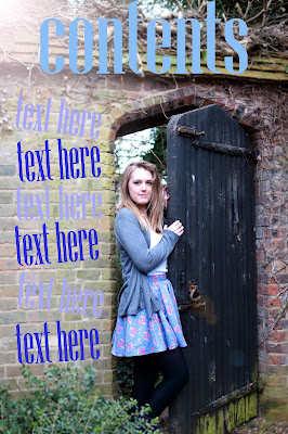
Above is my final contents page which will be used in my music magazine.
I chose to use this image as my contents page as it looked effective and creative. I was originally going to use this as my front cover image but after feedback i saw that it was not close enough and there was too much background. The font i chose on the page links in with the colour scheme of the picture. The use of blues blacks and light blues matches the models clothing as well as the scenery in the background. Although i found it hard to find a font and colour that would stand out aswell as match the colour scheme of the picture.
6. What have you learnt about technologies from the process of constructing this product?
This is a collage of the technologies used when constructing my music magazine.

These are the technologies i used for the process of constructing my music magazine project.
I have learnt different ways of editing images using photoshop and picasa. I new how to use these before but this project has furthened my knowledge of the two programmes. I learnt how to change main colours of images, turning them to black and white and sepia. I also learnt how to manipulate text in photoshop by rotating it and lengthining and shortening writing and fonts.
I perfected my photography skills by taking a lot of pictures so i was able to choose from a variety. This made it easier as i had more photos to work with which were very desriable.
7. Looking back at your preliminary task what do you feel you have learnt in the progression of it to the full product?
Our preliminary task was to create a school magazine front cover and contents page. After doing this preliminary task i had learnt a great deal about editing and graphics such as fonts and colours. After doing my next task which was the music magazine i could see how much i had progressed from before. My photography skills was an obvious progession throughtout these tasks.
Below I have presented my school music magazine image for the front cover and my music magazine image for the front cover.

In these images you can see how my photography skills have progressed. I used a different type of camera on my music magazine as i learnt that they were a lot better quality. The position of my models and costumes are alot better on my music magazine than my school one. I can see that my school magazine was too plain and the image was not clear enough.Overall i can also see the improvement in quality between the two tasks.
As well as seeing improvement between the two front covers of each task, the contents pages had also progressed allot since the school magazine preliminary task.
Below I have put my preliminary task contents page and my music magazine contents page.

After doing my preliminary contents page I had learnt from feedback that it was too simplistic and plain. I took this into account when creating my music magazine contents page. On my music magazine contents page i ensured there was allot of colour and boldness so it would stand out. I even included an image on my contents page, unlike in my preliminary task. I did this because after research is saw that any typical music magazine would have many images on each of their pages. Especially the contents page.
Overall I can see that my photography skills, editing skills and graphic skills have progressed a significant amount.